 "IanZ - limited-slip indifferential" (ianz-limited)
12/05/2016 at 01:17 • Filed to: Rant, Typeface, Pagani, Huayra
 10
10
 16
16
 "IanZ - limited-slip indifferential" (ianz-limited)
12/05/2016 at 01:17 • Filed to: Rant, Typeface, Pagani, Huayra |  10 10
|  16 16 |
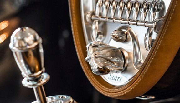
The typeface used in the Huayra’s interior is wrong. It’s hella basic for such a glorious interior, and not intelligible to excuse its ugliness.

Look at that. Might as well be
Times New Roman Italic
. The word that springs to mind when I see it is
amateurish
. It’s an incongruously lazy choice for such a meticulously designed car.

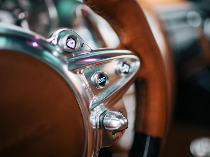
The
escape
button is clear and legible. Perfect. But it’s simplistic and I understand if you want something more stylish, Mr. Pagani. You’re a stylish man. But the typeface you picked wasn’t stylish! It’s the equivalent of buying “slim-fit” khakis to look cool.

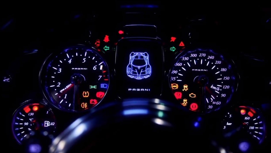
You even used a good typeface in the LED screen. The Pagani labeling would be perfect for use throughout the interior. It’s legible, futuristic, and blocky, which is what you want when it’s juxtaposed against more organic shapes.
Pick a better typeface, Mr. Pagani. Your cars are worth it.
 The Crazy Kanuck; RIP Oppositelock
> IanZ - limited-slip indifferential
12/05/2016 at 01:25 |
|
You sound like my sister, she is a graphic designer. She will rant about the type face on TV ads.
 Bman76 (no it doesn't need a WS6 hood) M. Arch
> IanZ - limited-slip indifferential
12/05/2016 at 01:29 |
|
!!! UNKNOWN CONTENT TYPE !!!
 IanZ - limited-slip indifferential
> The Crazy Kanuck; RIP Oppositelock
12/05/2016 at 02:02 |
|
I’m not a graphic designer or anything, but I like cool typefaces and little details like that.
 DrJohannVegas
> IanZ - limited-slip indifferential
12/05/2016 at 02:45 |
|
There are also too many conflicting font families in the interior.
 pip bip - choose Corrour
> IanZ - limited-slip indifferential
12/05/2016 at 05:48 |
|
could be a legal issue though.
 Connqr
> IanZ - limited-slip indifferential
12/05/2016 at 06:56 |
|
It should clearly have been Comic Sans.
 Tapas
> IanZ - limited-slip indifferential
12/05/2016 at 07:14 |
|
Tbh you have a point. I don’t want to buy a multi million dollar car with type face from a 90's wall clock.
 Daily Drives a Dragon - One Last Lap
> IanZ - limited-slip indifferential
12/05/2016 at 07:56 |
|
I’m sure they could do it for you if you asked really nicely in your order
 Tripper
> IanZ - limited-slip indifferential
12/05/2016 at 08:08 |
|
Hah yea you’re right! It looks like the text that you commonly see on cheap/knockoff electronics.
 Luke's Dad Sold His 2000TL To Get a Sienna
> IanZ - limited-slip indifferential
12/05/2016 at 08:09 |
|
My friend does graphics on the side. We were playing this game called “We Didn’t Playtest This” and it has completely wacky rules one of which was you have to say “Comic Sans is a great font.” before every one of your turns.
He almost died.
 fintail
> IanZ - limited-slip indifferential
12/05/2016 at 09:32 |
|
I wonder if the Prius and other irritating products use Comic Sans.
 davesaddiction @ opposite-lock.com
> IanZ - limited-slip indifferential
12/05/2016 at 11:23 |
|
I wonder if they use the same typeface for the Italian version...
 IanZ - limited-slip indifferential
> davesaddiction @ opposite-lock.com
12/05/2016 at 11:24 |
|
Oooh that is a good question.
 Noodles
> IanZ - limited-slip indifferential
12/05/2016 at 11:40 |
|
I have thought this since I first saw a photo of the interior. & you’re right, the PAGANI font would be great
 vicali
> IanZ - limited-slip indifferential
12/05/2016 at 11:45 |
|
agree.

 AntiSpeed
> IanZ - limited-slip indifferential
12/05/2016 at 15:31 |
|
Hey! Times New Roman can be cool! Like... when it’s layered on top of itself in an orange circle...